EvoNatura is developing an additive that makes plastic biodegrade at the end of its life. As they prepared to secure their first pilots, they needed a brand that could communicate something complex and stand out in their space.

01 — The chALLENGE
EvoNatura came to us mid-rebrand. They had started where most founders start, with the logo, and quickly realised something was missing underneath it.
They needed more than a visual refresh. They needed a brand built on a story strong enough to walk into pitching competitions, investor rooms, and industry conversations and be taken seriously.
Plastic Engineered
to Expire.
End of waste, built in.
The website — before & after

The live site, up close


02 — Strategy
The clearest thing about EvoNatura's technology is also the most commercially important, manufacturers do not have to change anything about how they work to use it. No new equipment, no new processes, no disruption. It just works within what already exists. That was the insight we built everything around because it was the answer to the first question every manufacturer would ask before agreeing to a pilot.
01
Positioning & Messaging
Traded industry jargon for clear language that locked in their positioning and set them apart in a crowded market.
02
Content Strategy
A roadmap for speaking to each audience and building their company and founder brands on LinkedIn to attract partnerships.
03
The Website
From a simple landing page to a full site that tells the audience who it's for, what's being built, and why they should listen.
04
Logo & Visual System
We left the traditional sustainability look behind and built a brand system that speaks to their technology and innovation.
05
The Tagline
"Plastic Engineered to Expire" was tested at industry events and understood immediately after months of confusion.


03 — Identity
A logo should tell a story. Through our Double Dip Workshop, EvoNatura shared something they had been holding back.
A mother and daughter building a company together to carry forward their grandfather and father's legacy. The logo was designed around that, two elements working as one, symbolising collaboration, continuity, and a shared sense of purpose toward a single goal.
The logo system was designed to work across every context the brand would need to show up in, from pitch decks and investor presentations to manufacturer conversations and digital channels, with primary, secondary, and favicon versions built into the system from the start.


Integrity Navy
Microbe Glow
Action Signal
Molecular Black
The colour decision came from the same place as the tagline. The dark green palette that dominates the sustainability space signals environmental intent, but it also signals sameness. EvoNatura's technology is disruptive and precise, and the identity needed to say that visually before anyone read a word. Neon green for the boldness of the innovation, dark navy as the anchor that builds trust, and electric blue that demands attention. Scientific and unmistakable.
The icon system
Complex science needs simple communication. The EvoNatura icon system translates technical concepts, certifications, and data points into clean, digestible visuals that work consistently across every brand touchpoint.


The brand in the wild


04 — What We Delivered
Strategy
A sharp market position that gives them confidence pitching to investors and clarity on where to focus next.
Voice
A confident tagline and message framework that filters out jargon so they can explain their value instantly.
Visuals
A full logo suite, colour, and type system that made them look like the innovative, credible force they already were.
Website
A clean, five-page site built around clarity and conversion — showcasing the technology simply and giving partners an easy way to connect.
Content
A plug-and-play kit of content pillars, calendar, and templates for effortless, consistent publishing.
Playbook
A clear brand guide so anyone can keep the visuals and messaging consistent without calling us in.
05 — The Impact
We handed over a brand system that keeps people talking even when they aren't in the room. Heading into 2026, they finally look the part — confident positioning, a clear story, and momentum toward product–market fit.
→
The new identity turned heads at conferences; the tagline landed immediately after months of confusion.
→
The logo now tells a story, shifting focus from what they make to why it matters.
→
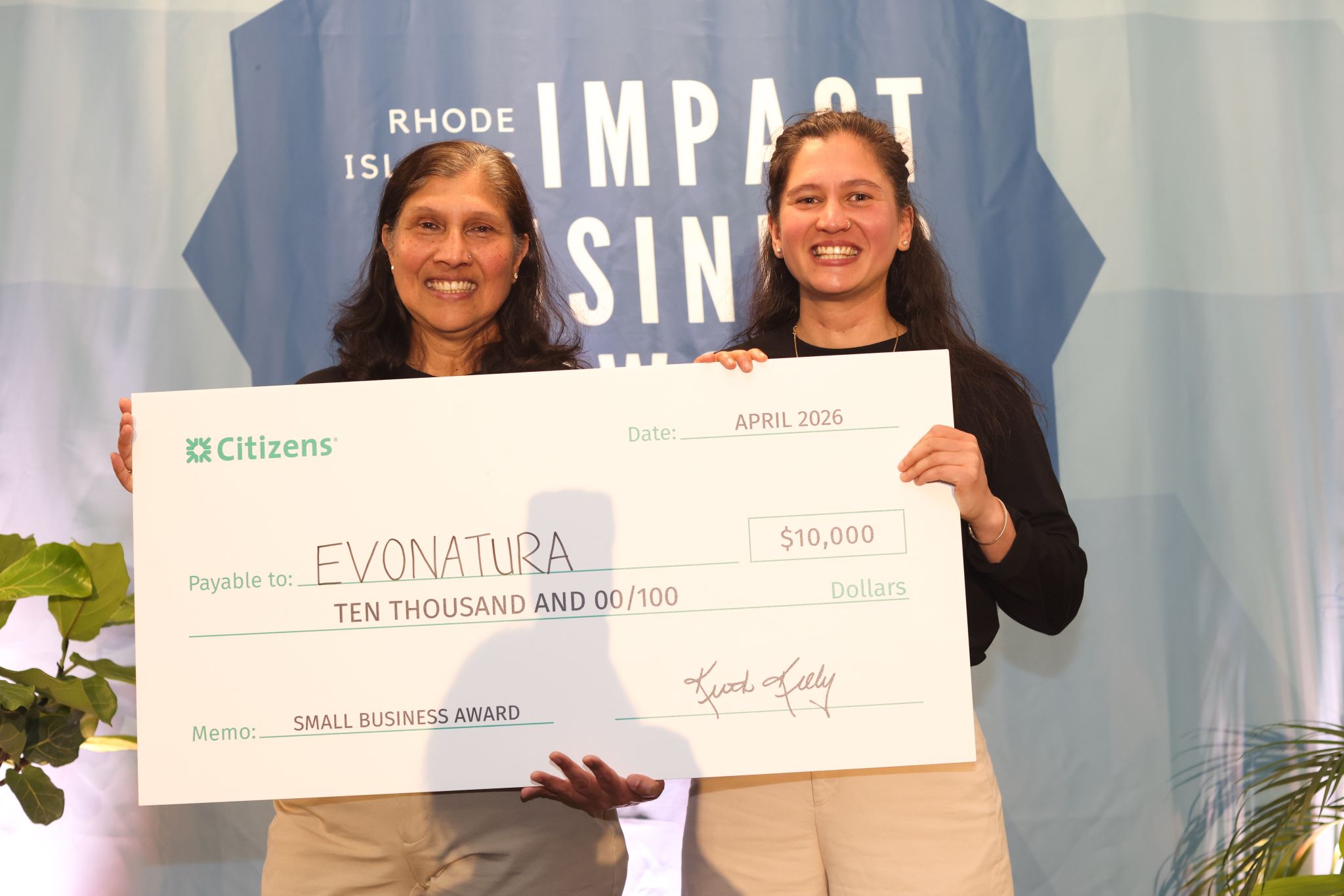
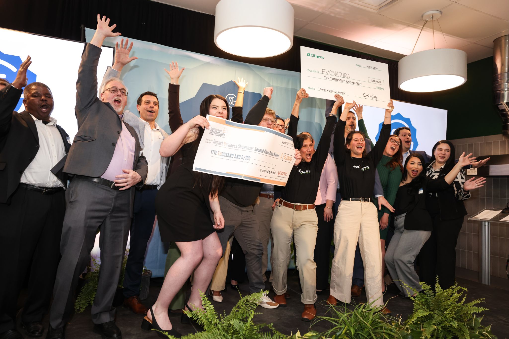
The narrative secured their first pilot meetings and won pitching competitions consistently.
"
They have a unique perspective that made the final result of our brand feel so elevated and special. It was amazing to see them create something so beautiful out of thoughts we couldn't even put into words.
Priyanka S. — Co-founder, EvoNatura