Retail — Réain
The cycle of abundance.
Thérèse had spent 25 years in Barcelona and was about to open a secondhand and upcycled clothing store in the city she knew better than anywhere. The store had a clear point of view. That every object deserves a second life, and that finding something secondhand should feel like a discovery rather than a compromise. What it needed was a name, an identity, and a strategy to build an audience before the doors even opened.
01 — The Challenge
Starting from zero, with the doors about to open.
Thérèse came to us with a signed space, an opening date on the horizon, and a store that existed entirely in her head. Secondhand retail is a crowded space and the stores that stand out tend to rely on a founder's existing following rather than a brand strong enough to carry the store on its own.
Réain was starting from zero, which meant every decision, from what the store was called to what the first post said, needed to do real work from day one.
02 — The Name
Ré + Áine. The cycle of abundance.
The name came first, and it came from a deliberate search through Irish mythology, Celtic symbolism, and the spaces between languages. The name needed to carry Thérèse's Irish roots without being inaccessible to a Barcelona audience, feel warm without being gendered, and hint at the circular economy without spelling it out.
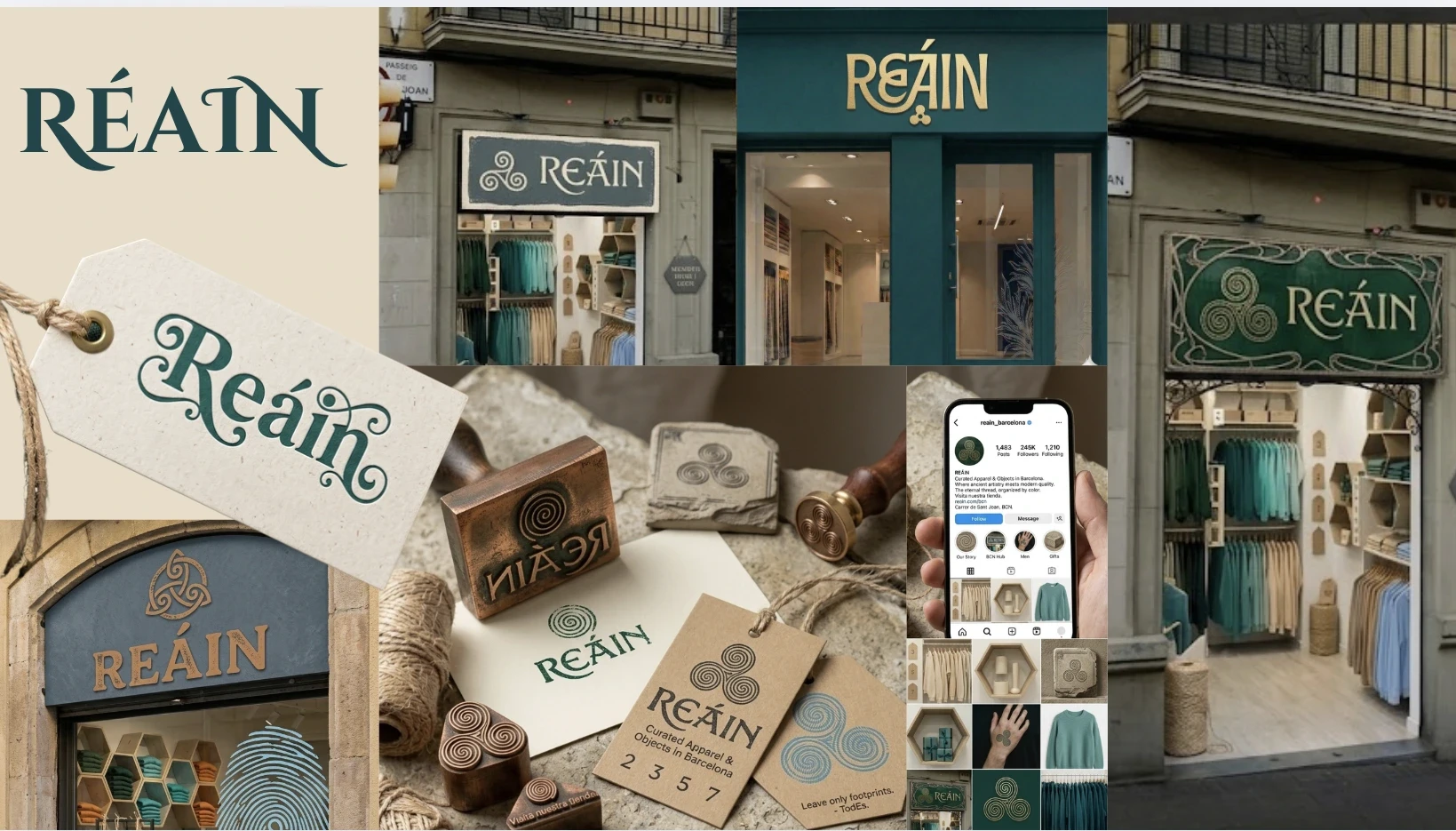
RÉAIN was built from two ancient Irish words: Ré, the Irish word for moon, cycle, and era, and Áine, the Celtic goddess of abundance and radiance. Together, they mean the cycle of abundance. The accent is intentional, signalling immediately that this name comes from somewhere specific and has a story behind it.

The tagline
Giving your pre-loved items a second chance at life.
03 — Voice & Identity
The Neighbourhood Finder.
The brand personality we uncovered is The Neighbourhood Finder. Warm and down to earth, playful over serious, a storyteller rather than a curator. The neighbourhood friend who happens to know everything.
The brand voice follows from that. Réain talks about real things in a real way, the story behind this jacket, the person who made that bag, the fact that you can get this adapted to fit you properly.
The messaging was built around one core belief: things made well, kept well, and found well are simply better than things made cheaply and thrown away fast.
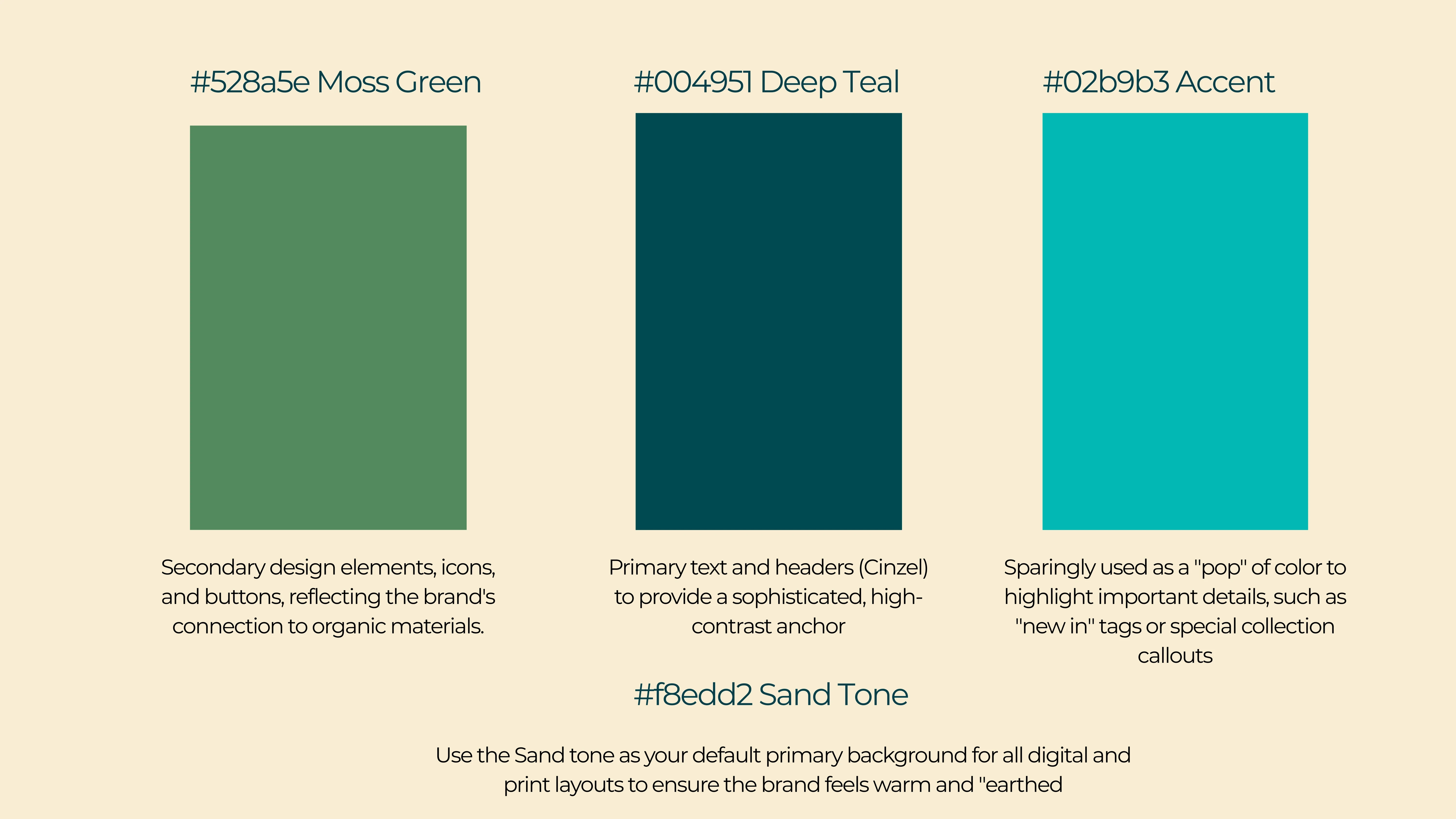
Moss Green
Deep Teal
Bright Accent
Sand
The colour palette came directly from where the store lives. Moss green and deep teal drawn from the natural textures of the Mediterranean coastline. Sand tone as the default background, warm and grounded. A bright teal accent used sparingly to make key moments pop. Together the palette feels artisanal and timeless without being predictable.
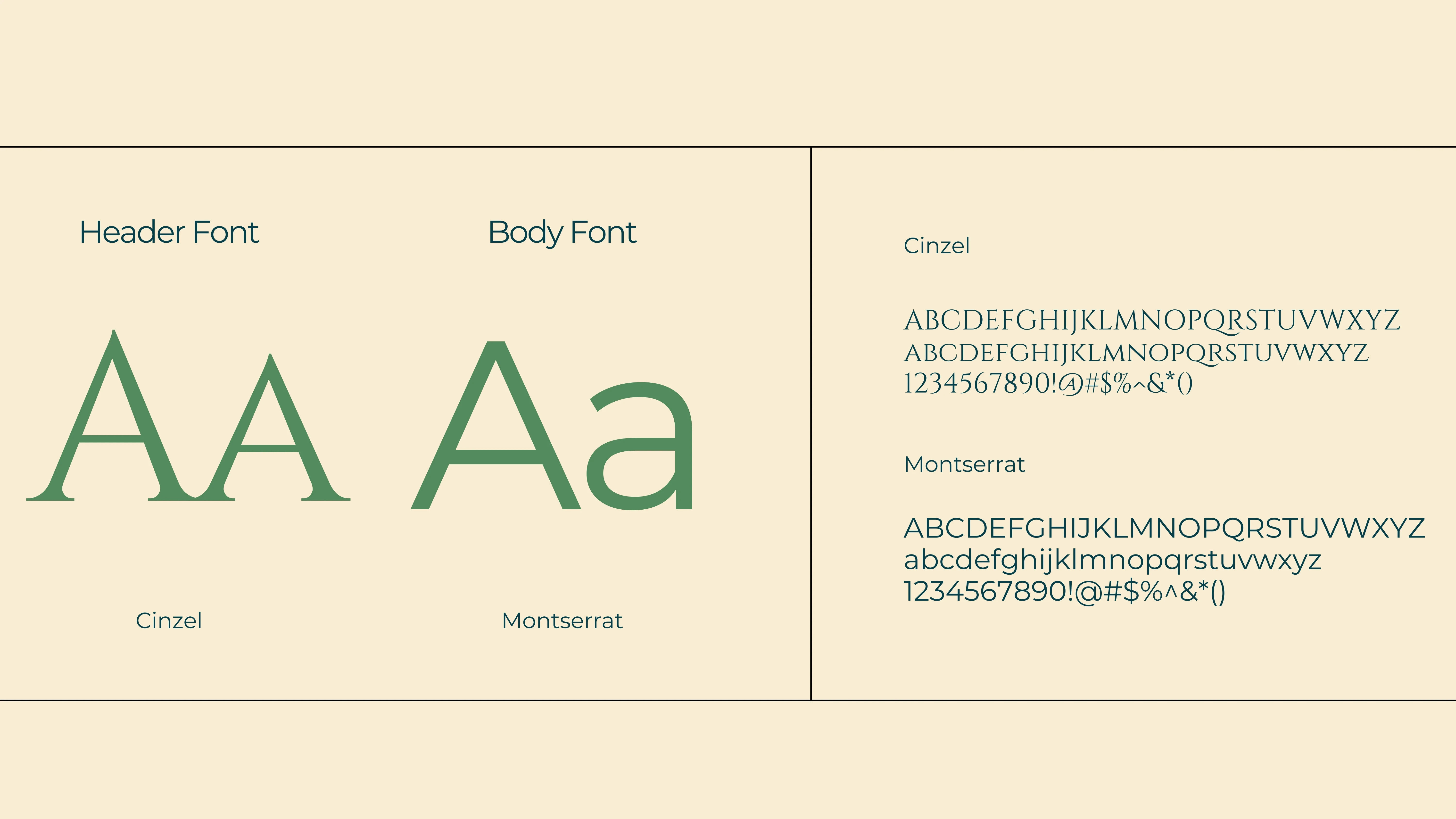
Typography was kept equally grounded. Cinzel for headers, giving the brand a sophisticated, high contrast anchor rooted in classical letterforms. Montserrat for body copy, clean and readable without losing warmth.
04 — Social Strategy
The story is always the lead.
The social media strategy was built around a single insight: the story is always the lead. Not the price, not the size, not the product description. In a store where every piece has come from somewhere and is going somewhere new, that story is the differentiator, and it is what makes the account something people want to follow rather than just shop from.
→
A three-phase launch strategy taking the store from tease to reveal to ongoing rhythm.
→
Four content pillars to give every post a clear purpose, plus a caption formula to keep the voice consistent.
→
A pre-launch campaign built around #réainstory, seeding the store's core idea before a single customer had walked through the door.
05 — The Work
Naming
A name rooted in Irish mythology with a story built in — plus RÉBOANN, a future collection name ready for when the store expands.
Strategy
Brand positioning, personality and voice, and a messaging framework built around one core belief.
Identity
Visual identity, colour and typography, creative direction, and a brand book built to hand off cleanly to her graphic designer and social media manager.
Social
Social media strategy, content pillars, launch campaign ideas, and a caption framework — all in place before opening day.
06 — The Outcome
A brand in place before the doors opened.
A store with a name rooted in something real, a brand built to grow with it, and a strategy in place before the doors opened.